WHY ZARA'S SITE WAS CHOSEN
Well Known Retail Site
Known for high traffic and global reach, making usability crucial for sales.
Common Complaints
Users frequently report difficulty navigating, especially when searching for a specific items.
Balance of Aesthetics and Accessibilty
The website prioitizes visual desgin, but contrast between text and image are overlapping, making it hard to read
PROBLEMS
COMPETITIVE ANALYSIS - NAVIGATION
H&M
Simple, intuitve navigation with clearly labeled categories, easy to find items.
COMPETITIVE ANALYSIS - VISUAL HIERARCHY
ZARA
Poor readability due to overlapping text on images, lacks clear selection and visual emphasis on key sections.
ARITIZA
Strong visual hierarchy with bold text, clear sections and high redable fonts.
H&M
Balanced visuals and text, clear visual hierarchy guides users smoothly
DESGIN ANALYSIS
To create a user friendly redesgin of parts of Zara's app that improves accessibility, simplifies navigation, and enchances the overall shopping experience.


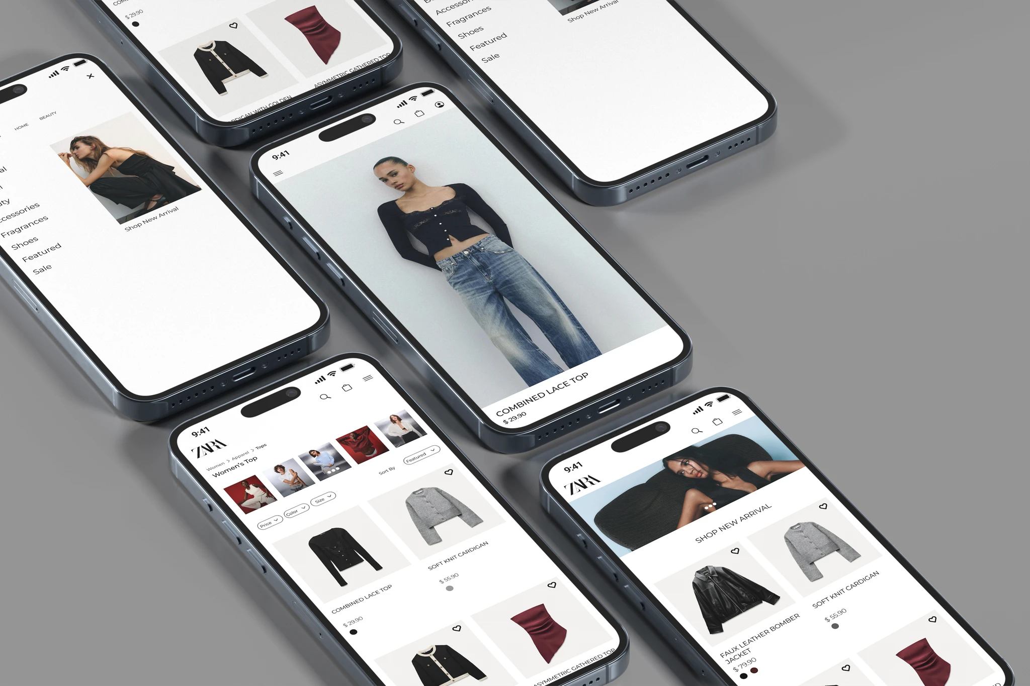
MY PROTOTYPE
LEARNINGS
Through this redesign project, I gained proficiency in Figma and learned the importance of time management, realizing how much effort and planning a project of this scope requires. I also deepened my understanding of color contrast, recognizing its role in ensuring readability and accessibility. These insights have shaped my design approach and will inform my workflow in future projects.